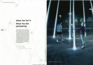
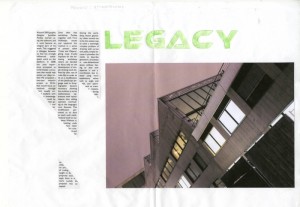
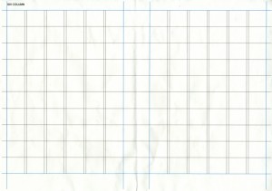
Second year Graphic Design students undertook a 4-hour workshop this week exploring bulk text within a grid structure. The workshop runs alongside their current studio project of designing a 16-page supplement.
The aims of the workshop were to develop skills, knowledge and understanding needed to design effective and creative page layout solutions using typography, page layout conventions and to reinforce good practice using digital publishing applications.
Key areas explored included; how to analyse copy and introduce emphasis and hierarch through the use of type; how to organise bulk text within a grid structure with due regard to the use of space and headings; how to layout and arrange text / image with an appropriate emphasis and meaning.


